What personalities do your logo display? Is it Economic or Luxurious? Is it Playful or Serious? Is it Loud or Quiet?
Through good logo design, the values of your brand are infused into your logo’s personality. Especially for startups and small businesses, the logo is the face of your brand and is carefully designed show your brand values.
There are countless personalities your logo can take on. Read on to find a list of the 7 most important types of personalities displayed by logos.
1. Economical vs Luxurious
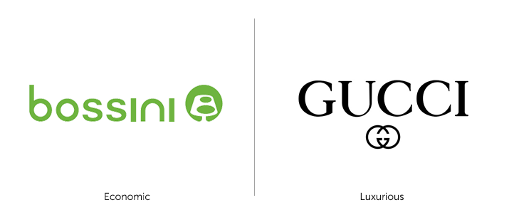
Bossini Logo vs Gucci Logo
Economical logos (Bossini) are suitable for brands that target customers looking for budget, cheaper products. These customers want to pay less for more, and price is a major consideration for them.
Luxurious logos (Gucci) are classy and elegant and are suitable for high-end brands. Customers here care less about price and more about quality and image.
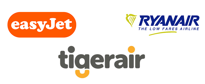
Colours: Economic logos tend to use bright colours as a primary or secondary colour. Bossini (above) uses a bright shade of green, while budget airlines (below) use shades of yellow and orange in their logos. On the other hand, luxurious logos tend to feature mysterious shades of black, grey and other muted colours.
Typography: Economic logos usually feature san-serif fonts, while most luxurious logos use elegant serif alternatives.
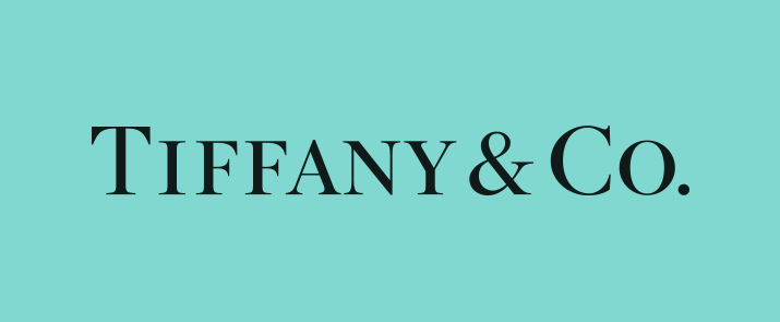
Tiffany & Co. uses a didone serif font on a shade of muted cyan
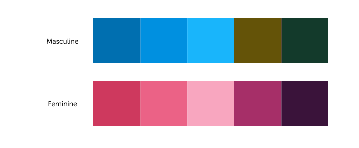
2. Masculine vs Feminine
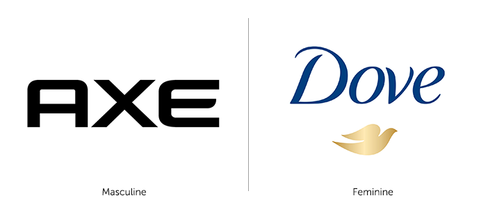
Axe Logo vs Dove Logo
Masculine and feminine logos are suitable for brands targets a specific gender. Logos for men (Axe) feature sharp edges and bold design elements, while feminine logos (Dove) have soft curves and gentle elements.
Masculine and feminine personalities also feature different colour schemes. An example of gender-based colour schemes below:
3. Simple vs Elaborate
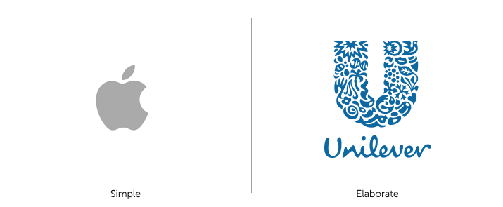
Apple Logo vs Unilever Logo
Simple and elaborate personalities depend on your brand values. Apple’s logo is the hallmark of simple logo design that is instantly recognisable. It represents Apple’s ideology of bringing simplicity and ease-of-use to all its products.
On the other hand, Unilever successfully uses an elaborate, detailed logo to represent the wide range (over 400 brands!) of nutrition, hygiene and personal care products it offers.
4. Playful vs Serious
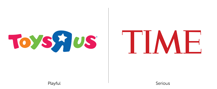
Toys “R” Us Logo vs TIME Magazine Logo
Playful personalities are for brands like Toys “R” Us – by using friendly, colourful elements and fun typography, it gives customers a strong impression of fun, kid-friendliness and games.
On the other hand, TIME Magazine reports on important world events and employs a serious personality, through use of a hairline serif font with a deep maroon colour.
5. Loud vs Quiet
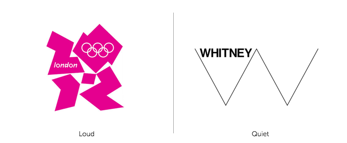
London 2012 Olympics Logo vs Whitney Museum of American Art Logo
Loud logos are screaming to be heard – like the controversial London 2012 Olympics logo. With its jarring shapes and attention-grabbing colours, London 2012 is a great example a loud logo for brands that demand attention.
Whitney’s logo on the other hand uses a simple line motif, coupled with a simple sans-serif. Quiet logos are great for the museum like Whitney, or brands that value intelligence, strategy or quiet contemplation.
6. Modern vs Classic

Pepsi Logo vs Coca-Cola Logo
Pepsi’s newest logo, released in 2008, meet all the criteria of modern design – clean, simple typeface and a minimalist, meaningful icon. (A little too meaningful, perhaps.) Coca-Cola’s iconic logo is mostly unchanged since the 1887! That’s a classic logo with all 100+ years of beautiful, cursive serif typography.
7. Novel / Different vs Traditional / Conservative
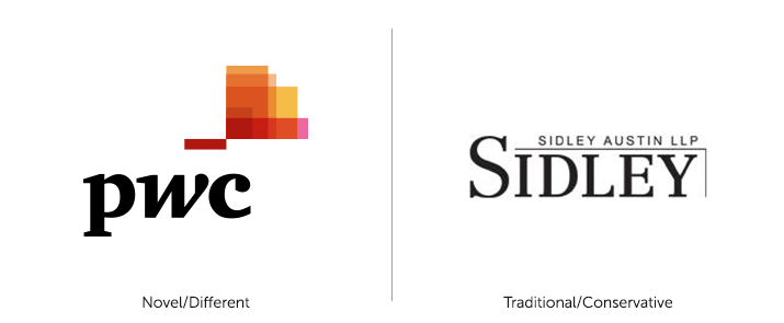
PwC Logo vs Sidley Austin LLP Logo
How novel or traditional a logo is depends on a the business’s competitors. PwC and Sidley Autin LLP are two of the largest audit and law firms in the world. While PwC uses a logo that differentiates itself using bright colours and abstract icon, Sidley chooses a more conservative approach with a simple serif font to represent its more traditional, reliable brand values.
What is your logo personality?
It is important for you to know what your logo personality is. Logos can have a combination of all kinds of personalities – novel and fun, or simple and serious; luxurious and classic, or economic and elaborate. This is what makes logo design both challenging and incredibly impactful in creating a unique brand identity.
Leave a Reply