Sometimes, my friends ask me how I got into front-end development. I would say I kinda stumbled into it; but the truth was, I didn’t really know. So last week, I made a deep dive into the dark corners of the Internet to dig up every front-end project I’ve worked on since I was 12.
And boy, was it a dive. 🤦
So here they are. Every terrible decision, every embarrassing website, every mistake and lesson learned that made me the front-end developer I am today. Here they are, in their full unfiltered glory.
(If you’re just starting out in front-end development, I have included nuggets of knowledge I’ve learned along the way that I hope will save you time in your journey. If you’re an old hand… I hope this story gives you a giggle or two 💁♂️)
12 years old
Let me set the scene. It was 2007. Steve Jobs had just introduced the iPhone. Everyone was using MSN Messenger. Nobody liked Windows Vista. These were things I remember, but I don’t remember when exactly I decided to make a website.
I liked the idea that something put on the web can be seen by anyone around the world, like magic. Surely it couldn’t be that hard. Could it?

I was wrong. It was hard. I had no idea what I was doing.
At one point, I couldn’t even figure out how to use a <br /> tag, which creates a line break. I was confused why a regular line break in the code didn’t render a similar break on the webpage. I tried using <p> tags which creates paragraphs, but I didn’t understand the concept of wrapping. I even tried setting up a table just to start a new line.
To make matters worse, despite all that hard work, it was still hideous (even for the 2000s). I remember my classmates making fun of it when I shared the link with them over MSN Messenger. Then again, could I blame them? It had every atrocity of Web 1.0: gif, marquees, poorly-tiled backgrounds, Flash widgets… you name it. I was discouraged. And so, I learned my first lesson.
💩 Your first project will be bad. My first HTML page was terrible. My first CSS file was so messy Marie Kondo wouldn’t touch it. My first mobile app was ignored. My first React app crashed every minute. Learning front-end is hard because it is the intersection of many ideas from design and computer science, and it is okay to not get it the first time.
I promise it gets easier. Over time, you will realize that you’ve built up a set of transferable skills (HTML, for example, will help you with both building React components and Android activity layouts). Recognizing that you’re bad at something is the first step to being good in front-end.
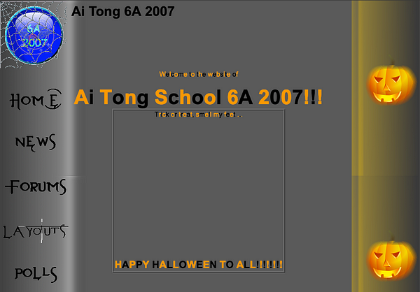
I knew it was bad, but I also knew I could do better. So for Halloween, with the help of Gimp, I spiced up the site with a fresh coat of pumpkins and Evanescent typography. Hey, it even had an original adventure game where players saved a fantasy world with magic 🧙
During the redesign, I also learned a neat trick. I realized there was no hiding in the world of HTML and CSS. Every technique, every secret was just one View Source away. Not even Apple could hide the secrets of their beautiful product pages, and I would spend hours on their site unraveling their mysteries.
If someone else could do it, then so could I.
Somewhere along the way, my classmates stopped making fun of me.
🔍 View the source. Whenever you see something cool on a website, ask yourself if you can reproduce it. Could you do it with only CSS? JavaScript? If not, right click on it > click ‘Inspect’ (Chrome) or Tools > Web Developer > Inspector (Firefox) and try to reverse-engineer the code. Bookmark or keep a list of cool effects you’d like to try out someday.
14 years old
Before Snapchat and Instagram, kids had blogs. All my friends had one. Many of them were happy to personalize their blogs with off-the-shelf themes. But no siree, not me. Oh no.
I started by modifying existing themes for myself. Then, I would build themes as gifts for my friends’ birthdays. Kids from other classes came to ask me for themes. I became the blogskin guy.
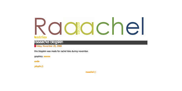
And so began my real foray into HTML. Each theme was a single-page HTML document with embedded CSS. Using pseudo tags like <$BlogItemTitle$>, I could control how and where each element was placed. The pseudo tags would later be replaced by actual content by the service provider. Finally, I was free from the confines of WYSIWYG editors!

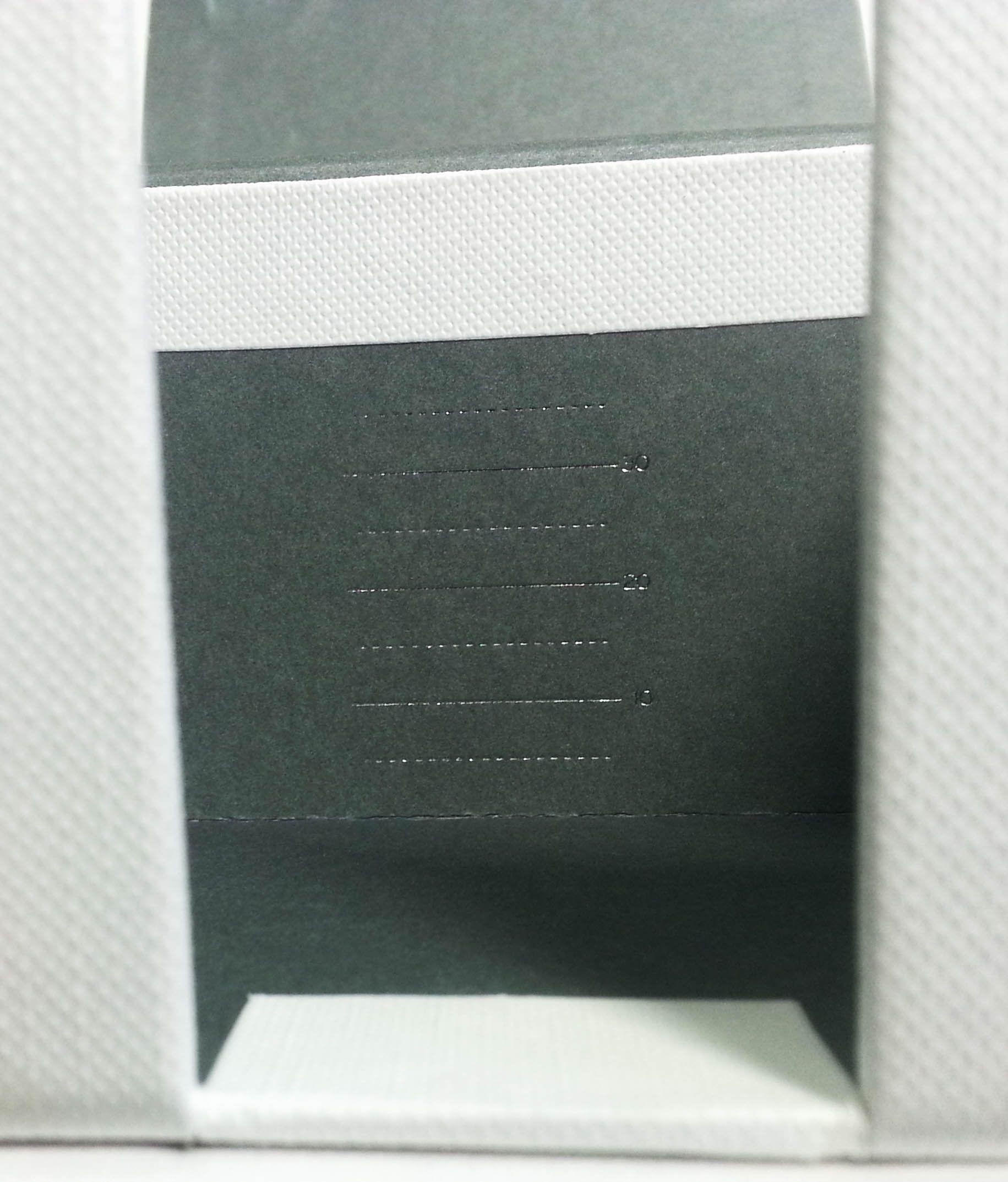
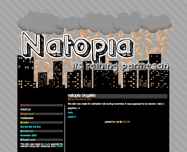
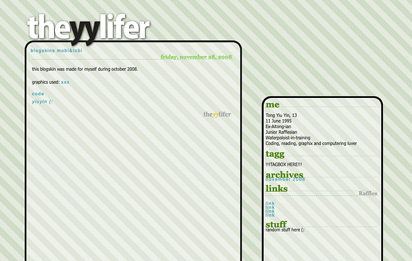
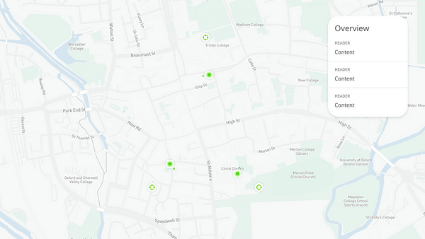
I remember spending hours moving elements with CSS, learning the differences between display and position types, margins and paddings. For one particular theme, I used four-colored stripes as a static background behind a white foreground with transparent patterns. Every element had to be perfectly aligned, so the pattern revealed itself when the user scrolled:

I loved developing themes. I realized that a webpage was not just 2D, but responds to people with JavaScript and CSS pseudo selectors, like :hover and :active. They grew and shrunk, faded in and out.
It was a living, interactive surface.
When done well, these interactions delighted people and I loved watching my friends’ reactions to their new themes. I pushed myself to try new ideas and techniques to find out what people enjoyed.
📱 ️Develop for interactions. Good front-end elements are discoverable (provides clues on how to use it) and provides feedback (reacts to interactions in an informative manner). For example, a button may change background colors on hover and increase opacity when clicked. Here’s a good video and book on the subject.
16 years old
On July 2013, I registered my first domain with a proper web host 🎊 It felt like a rite of passage, like I was finally doing something real. I set up my portfolio and since then it has been home to my projects and experiments. As I picked up new skills, it grew and evolved beside me.
I cannot overstate how useful having a domain and good server host had been for me. I could experiment with new front-end ideas on the web. I ran cron jobs that made my life easier. Whenever I needed a new space for a client or school work, I could create a new subdomain.
I felt like a big boy when I deployed my first website. It almost felt like I could do stuff like this for a living. That would be pretty cool, I thought to myself.
🏠 Set up a portfolio. This is a great project to learn about deploying to the web. Simple options include FTP, which lets you copy your files onto and serve them from a server. Once you’re comfortable with that, I’d recommend setting up Continuous Integration and Git. I’ve tried several providers before ending up with shared hosting on Dreamhost (affiliate link) which I’ve been extremely happy with. But there are definitely free alternatives out there.
18 years old
In Singapore, 18 year-olds have to spend two years in the military. By some stroke of luck, I was posted to an Army unit looking for a mobile developer. They asked if I had done anything like this before. I hadn’t, but how different could it be from developing a website? So I said yes.
Turns out, I was wrong. But hey, by then, I wasn’t one to let the lack of experience or qualifications stop me.

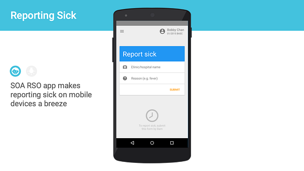
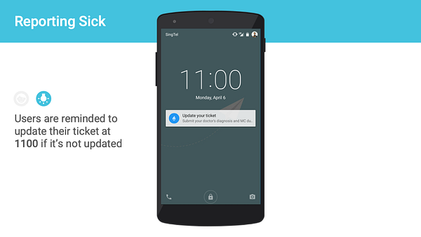
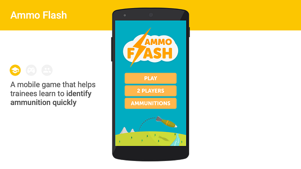
Let’s preface this by saying although I had worked with some JavaScript before, I had no concept of object-oriented programming, which was especially important in app development. My first task was to develop an Android app for an existing API which lets soldiers call in sick. My second was to create an educational game.
I spent days on Google and StackOverflow, asking hundreds of the most basic questions like “How do I create a text field” or “How do I make a button do things”. I spent weeks banging my head on the keyboard over NullPointerExceptions. By the skin of my teeth, I managed to churn out something halfway decent.
Although the apps looked attractive, the code behind it was anything but that. There were lines and lines of spaghetti code, no clear architectural patterns, and the logic was more tightly coupled than a chain link fence. It was impossible to maintain and for that reason, none of the apps I made could be actively updated.
It would be several years until I read about how to write scalable, clean front-end code. But when I did, I understood why it was important.
🧪 Write tests. Writing tests is probably the single most effective habit I picked up for writing better code. Remember how when you’re learning to code, you wrote functions that tried to pass several test cases? It’s like that, but now you’re the one writing the tests too! Writing good tests for each feature (unit tests) allows you to ensure your code works even when you’re changing other parts of the code base.
✂️ Separate your responsibilities. Do you have a function that is doing multiple things? Split them into multiple functions. Do you have a class with several chunks of methods implementing different features? Split them into multiple classes. Separation of responsibilities is perhaps the most important of the SOLID Principles. It makes your code readable and scalable. Clean Code: A Handbook of Agile Software Craftsmanship (affiliate link) by Robert Martin is a must read for any front-end developer.
20 years old
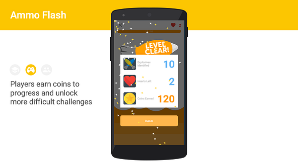
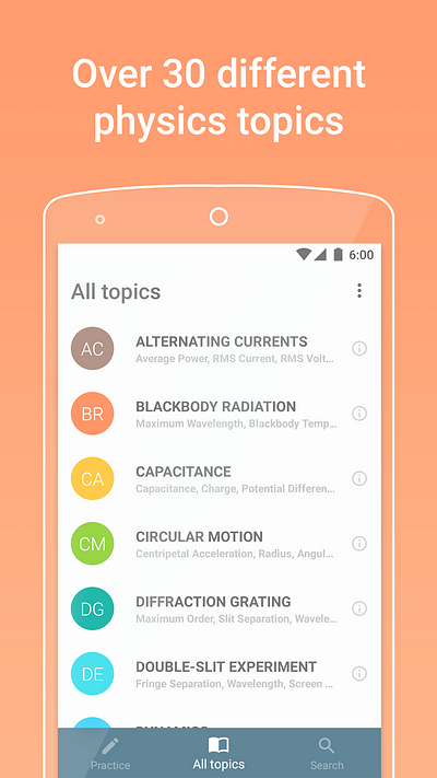
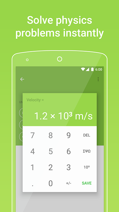
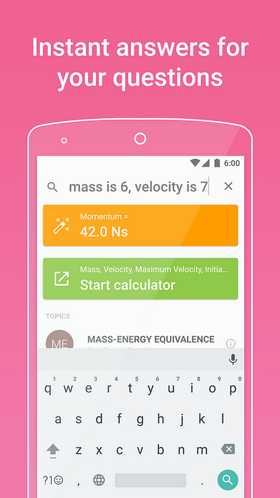
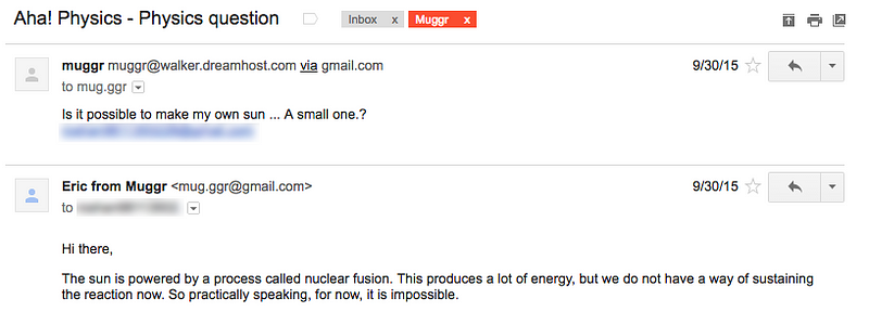
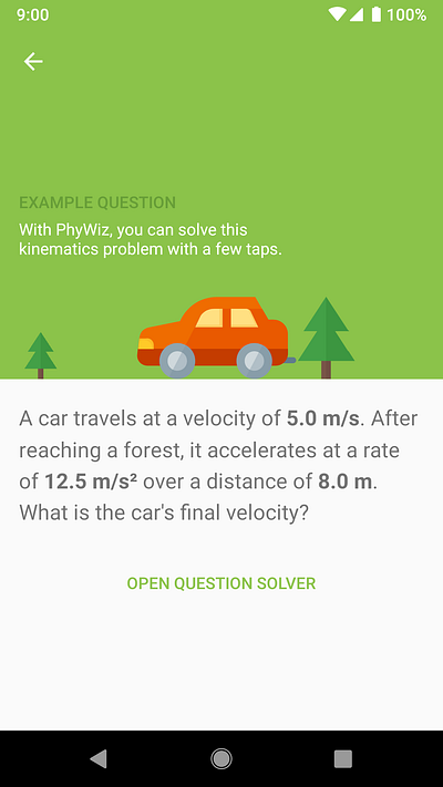
In June 2016, I published an app onto the Google Play store. It helps students learn about physics, which was a subject I’ve always loved. On the first day, it had 3 downloads. The second day, it had 5. On the third day, it had 1,000. I didn’t notice it initially, but the numbers kept growing. In its first month, it received 7,000 downloads. By September, monthly installs had grown to 15,000.
How? I hadn’t done any marketing at all.
Turns out, someone shared the app on Reddit (twice!) and people seemed to like it. It got picked up by several review sites and blogs. People started making videos about it on YouTube. At this point, I was so excited I was getting palpitations. I think I cried at some point. It felt like all my hard work was finally paying off.
I was brought back to when I built themes for my friends’ blogs as gifts for their birthday. Instead, now, I was giving gifts to thousands of people around the world. I suddenly realized how much I loved developing interfaces that could help people. That people loved.
The best part of this experience was getting to know the people using my app. I responded to every comment on Reddit and welcomed emails about any physics questions people might have. Sometimes, I got lovely little messages, like this one:
💌 Pick a project you care about. You’ve read the books. You’ve done the Codecademy course. You’ve mastered the hello worlds and recursive functions. Now what? Think hard about what areas you’re a relative expert in. Are you a foodie? A birdwatcher? A trivia master? Think about something that you would use. Think about how you can help the people around you or an ocean away. Scroll through the apps on your phone – can you improve any of them?
If you think you’ve found something, dive right in. Don’t wait till you are ready, don’t wait for permission. Throw yourself into the deep end; ride the highs and lows of front-end development. That’s how you create something that makes a difference.
22 years old
I continued to explore new ideas and techniques, working on projects I felt passionate about. Some of these were very challenging, but I’d learned to leverage what I know. Front-end development is full of transferable skills.
React was a revelation. After years of separating views from logic, it was a breath of fresh air to find a framework that elegantly integrates HTML, data, and logic. It was like I had been cutting trees with a butter knife all these years, and someone had just handed me a chainsaw.
Android is now a delight to work with. Many pain points have been taken care of and Kotlin is a pleasure to write. Some of the world’s best minds are working to make mobile front-end development better, with React Native, Flutter, and many more.
It’s a great time to be a front-end developer.
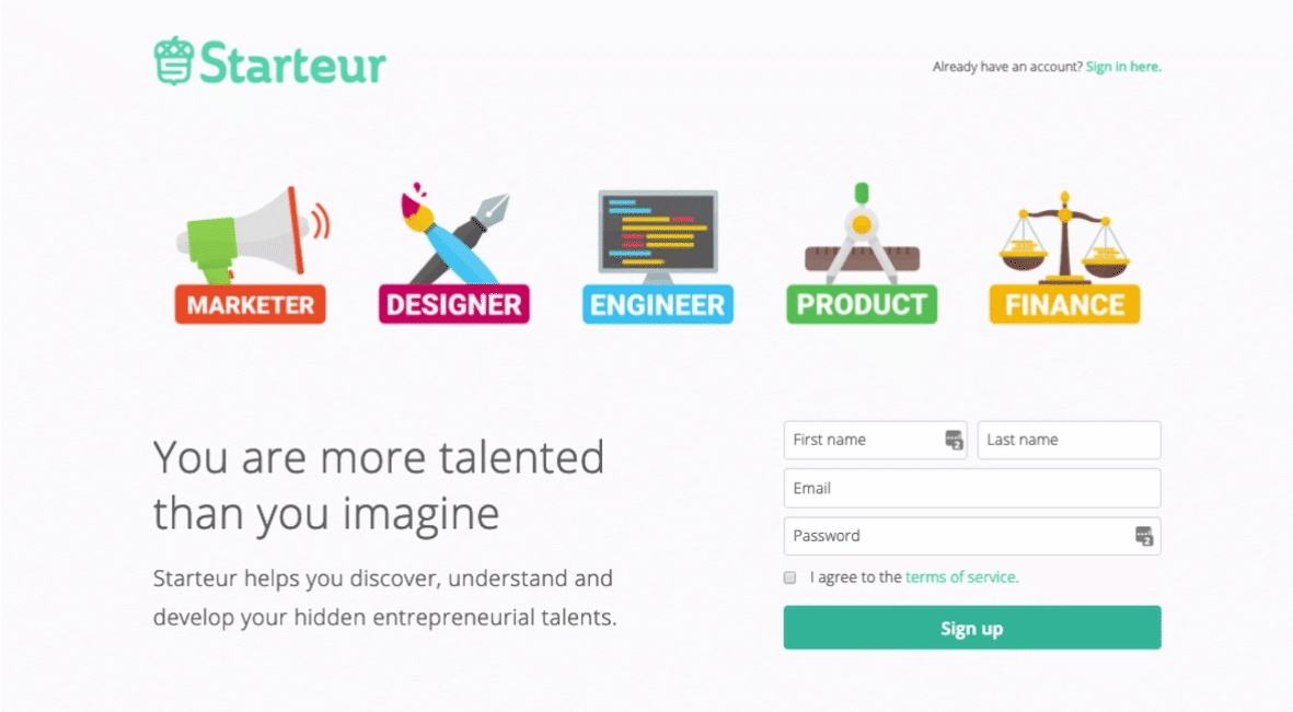
A couple of years ago, I developed a landing page with the tagline: You are more talented than you imagine. I wish someone had let me know that when I was 12, as I was about to give up after my first failure.
An acting teacher later told me that talent was nothing but the sum of hard work. In that way, I was very lucky that events led me to start my journey early. I am thankful for the people I met along the way who guided me and entrusted me, a bumbling teen, with their businesses and ideas. It started out as a lonely hobby for many years, but now I have friends who share my passions.
It’s been a great 10 years, and I can’t wait for what’s next.
👪 Find your community. No person is an island, and no front-end dev is an isolated floating div element. Join your local front-end meetups. Go to conferences. Follow git repositories you’re using. Write to publications. Listen to podcasts. Slide into some twitter DMs. Find people who will tell you: You are more talented than you imagine.

Liked this story? I’d love to get in touch!
Say hi on Twitter, LinkedIn or check out my website.